Spotify Wrapped and the power of Data Visualisation.
- lukefoylan
- Nov 7, 2025
- 4 min read

Let’s jump in the DeLorean and go back 24,000 years to what’s now known as the Democratic Republic of Congo.
Why? Because this is where you’ll find (reportedly) the first example of Data Visualisation, carved into a bone no longer than 10cm long. It now sits in a museum in Brussels, but it was found in 1950 by a Belgian geologist by the Semliki River and was given the name the Ishango Bone.
The curved bone is thought to be a tally stick, as it features a series of carved lines in three separate columns with a sharp piece of quartz attached to one end. There has been speculation that the marks represent simple mathematic procedures, others have speculated that the engravings served as a lunar calendar. Maybe it was a tally of how many times a fellow hunter-gatherer hummed their favourite melody. Who knows? Either way, the bone served as a tool for implementing visual structure to communicate numerical patterns way before writing systems even existed.
Fast forward 25,000 years and things are a bit different. Data Visualisation is still around, albeit a bit more mainstream. Which brings us onto the next topic – Spotify.

Spotify pulled off a masterclass in data visualisation when they unleased Spotify Wrapped in 2015 – it was actually called Year in Music for its first outing, but someone in Marketing had something to say about that. But why is it a masterclass? It’s nothing more than pie charts, numbered lists and simple mathematics underneath simple motion graphics – yet we see people sharing their musical milestones for the past year all over socials.
Here's why it’s a masterclass.
Spotify took something so deeply personal to us and presented it back to us, like a mirror of your personality over the past year. The infographics could pinpoint a breakup (we’re looking at you, Lewis Capaldi), a change in fitness routine or a prolonged period of nostalgia.
Instead of presenting raw, boring data, Spotify put it into an Instagram Story format with a clear beginning, middle and end. Like a story of your year in music. It’s fun to flick through and it’s easy to digest because it’s in bite-sized content – the type we’re addicted to.
We’re momentarily transformed into brand ambassadors for one of the biggest and fastest growing music streaming platforms in the world (696 million users worldwide) because we want to show people we don’t speak to anymore that we’re in Zach Bryan’s top 1% of listeners. All because of simple Data Visualisation. It’s powerful stuff, and it creates a week-long exclusive club for people who have Spotify, and creates an element of FOMO for the people who don’t – opening their minds to a potential change of streaming platform for next year.
So, why don’t other companies do this? Well, they do – Duolingo has a Year in Language which summarises users’ learning behaviour with longest streaks and mistakes made. Monzo has a Year in Monzo which gives a personalised summary of your spending habits (I’m not sure this is a good idea). Strava has a Year in Sport – a tailored review of your achievement over the past year – think personal records, elevation gained and so on. But none of these have the momentum that Spotify Wrapped has – I highly doubt anyone would want to share their spending habits – but having an edgy upcomer in your top 5 artists is worth sharing right? It shows you were a day-oner, and now you have proof…
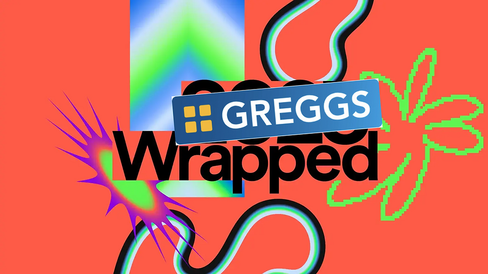
But what about the thousands of other companies? Krispy Kreme could have a field day with the donut/ring chart hybrid. Well, realistically these other businesses would have to be a predominantly digital platform that can track your purchases and activity to pull off a Spotify Wrapped concept. As you can understand, this isn’t achievable in physical stores, unless Kier Starmer makes us scan our digital ID every time we buy a Greggs sausage roll – then it might be achievable… But that means they’re missing out. Maybe it would be fun to see your year in pastys? Maybe we could collect receipts and tally up our lunchtime habits the traditional way (like on the Ishango bone) then present it back to ourselves the modern way (like Spotify Wrapped)? But that’s too time consuming, and you’d need a Motion Designer for that.
Anyway, getting back to the focus of this post. Data Visualisation. It isn’t going anywhere, it’s too useful. It makes our lives easier. If you think performance meetings are boring now, imagine what they would be like if you didn’t have that pie chart to spoon-feed you exactly how much money has been spent and who it was spent by. Whether it’s the carved markings on the Ishango Bone or the colourful motion graphics of Spotify Wrapped, data visualisation has always been about one thing – making information human. Whether it’s tallying lunar cycles or tracking your top artist of the year, we’ve always sought ways to give meaning to numbers through design. The tools have evolved, but the instinct remains the same – we want to see our data, not just read it. That’s the real power of data visualisation – turning raw information into something that connects, engages and, sometimes, even makes us feel seen.
Stay tuned for the Greggs Wrapped.

Comments